If you're reading this, then you likely have one question on your mind: Do I need a logo?
If you're finding yourself asking this, I can guarantee the answer is yes.
No matter your product or service, if you intend on selling it, you need a logo. In the following article, I'm going to go a little more in depth into this simple answer and explain what makes a logo great. Your logo is the customer's first impression of your brand, and there is no second chance at a first impression.
Brand Theme
A good logo should give an immediate sense of the theme of the brand. This sounds like a simple enough concept, but its nuance is what can make a logo cliché, serviceable, or great.
We, obviously, want great.
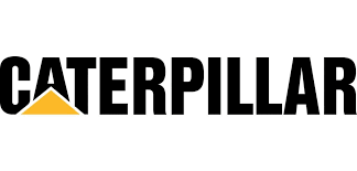
One of my favorite examples of this is CAT (Caterpillar) industrial engines. A logo that is known well beyond its customer base.
The yellow and black, the angular design, even the choice of text, gives a sense of industry. It has elements of caution signs, utilitarian lettering, and construction gear.
It does all of this while being subtle about it. Avoiding becoming a cliché and blending into the advertising landscape around it.
Prominence
A great logo isn't shy about it. It's not tucked away in a corner, or relegated to a pamphlet, it's proudly presented to the customer at any reasonable opportunity.
Now, of course, you can go overboard. But honestly, if done right, overdoing things is hard to do in this regard.
Just think of ordering a meal at McDonald's. From the time you walk in (or more likely, from the moment you open the app), the golden arches are thrown at you pretty much constantly. The walls, the menu, the trays, everything is aiming a logo at you. And even then, it doesn't feel desperate, or forced. You absorb the dozens of instances of the logo, without even really thinking.
Industry Relevance
This is one that many people have trouble with as they tend to want to focus on making the logo on brand. While both are important, they need to work together to make a great logo.
This is where research is going to help. You want to look at others in your niche, and you'll notice patterns. It could be as simple as most pizza places using a pizza, or something more nuanced like a tendency toward particular color palates for certain types of apps.
Don't be lost among the pizzas is my advice. Those logos are simply telling the customer what they sell, you want your logo to tell the customer what your brand is about.
Obviously the other side of this is creating a logo that is too esoteric. But in reality, your customers are likely coming across you searching for what you sell, your logo is less about the product, and more about the brand.
Distinctiveness
In contrast to prominence, which is the quantity of your logo, this is more about the logo itself getting the customer's attention.
Sport contains some of the best examples of this. At no point looking at a sporting uniform are you ever confused about which team the person is playing for.
![]()
To continue to dip into the sport well here, let's look at Head tennis. The palate is simple, the graphic design even more so. And the choice itself, cheeky, but it paid off in a huge way. It might take a half dozen looks before you realize it's a tennis racket, but the fact it made you keep looking is what makes it great.
Getting into how this can go wrong, well, overdone, it can make a logo gaudy. You want your logo to speak to the customer, not scream in their face.
Timelessness
Before we get started here, I want to mention something. Chances are, your logo will change over time. Being timeless is about longevity, not rigidity.
We're talking overall look, size and tone of your logo. You want something that can stay around as long as possible, and still not look dated.
This is more of a case of what not to do.
Looking modern is important, even in cases where a retro look is what you want to pull off, it's just that, a look.
But you want to avoid basing your logo around anything that is likely to be a passing fad. Not only is it likely to be seen as a low effort attempt to ride the fad, but if you end up being successful, it's going to require a redesign in a year or two.
In short, you want something that is going to be popular this year, but you need something that will be popular in ten years. Strike the balance as best as you can.
Versatility
Seems like an odd-man out in the list, but you have to put real thought into what your logo will be going on. Something that looks great on a shirt, or a door, may look warped and off-brand on a delivery truck or even the product itself.
What are your solutions? Do you have alternate logos? Or change the design to be more universal?
Your product or service will determine the viability of any given solution. Your take away should be to not let these kinds of issues surprise you. A little product testing beforehand is worth the wasted effort, and materials a batch of poorly thought out logo formats could cause.
Conclusion
To close everything out, your logo is the lynch-pin of your brand. It's the one thing, beyond your product or service that the customer will automatically associate with your business.
Give it the same amount of time, effort, and resources that you would give any other critical part of the infrastructure of your business. It's not just the ink you slap on your uniform, or the pixels you arrange on your home screen, for all intents and purposes, it's the face of your brand.