2024 has been an interesting year for brand makeovers. We've seen some big names step up their game and come out with fresh new looks. Whether it's a tweak to the logo or a complete overhaul, these changes are all about staying relevant and appealing to today's consumers.
According to Interbrand's annual brand value study, successful rebranding can significantly impact brand equity and consumer perception. Let's take a peek at the 10 best rebrands of 2024 that really caught our eye.
Overview of 2024's Top Rebrands
- Jaguar went sleek and minimal, focusing on electric future
- 7UP embraced a vibrant, retro-modern look
- Jell-O kept it classic with a modern twist
- Eurostar unified with Thalys for a new identity
- Tupperware highlighted functionality in its design
- Goldfish temporarily became "Chilean Sea Bass"
- Kit Kat adopted a chunky, modern design
- Bose refreshed with vibrant colors and partnerships
- Amazon Prime Video introduced dynamic visual identity
- WhatsApp embraced vibrant green accents
1. Jaguar: Electrifying the Future

In 2024, Jaguar made waves in the automotive world with a major rebrand, signaling a bold new direction. The unveiling of their Type 00 concept car on December 3rd marked a significant shift, moving away from traditional models like the XE and E-Pace.
Jaguar's rebranding effort is all about electrification and modernity. The iconic leaping jaguar logo has been streamlined into a sleek, minimal design, emphasizing the company's focus on becoming an all-electric luxury brand by 2025. This transformation is not just cosmetic; it's a statement of intent to lead in the electric vehicle market.
Research from McKinsey on automotive brand strategies shows that successful automotive rebrands often coincide with major technological shifts in the industry.
The new logo features an uppercase 'J' and lowercase 'r', showcasing a bold, artistic style that reflects Jaguar's commitment to modern design.
Key Changes:
- Logo Redesign: The leaping jaguar is now more minimalist, embodying the brand's future-focused vision
- Brand Philosophy: Embracing 'exuberant modernism,' Jaguar aims to be unique and fearless
- Electric Commitment: By 2025, Jaguar plans to be an all-electric brand, moving away from petrol-powered vehicles
Jaguar's rebrand hasn't been without controversy. The new design and concept car have sparked debates among enthusiasts and critics alike. Some love the fresh look, while others miss the traditional elements.
Jaguar's transformation is a reminder that rebranding is about looking forward. It's not just about changing logos or aesthetics; it's about aligning with future goals and market trends. According to Harvard Business Review's research on brand strategy, successful rebrands require a clear vision of the future market position. Jaguar's leap into the electric future sets a precedent for the automotive industry, challenging others to rethink their strategies.
2. 7UP: Vibrant and Retro-Modern
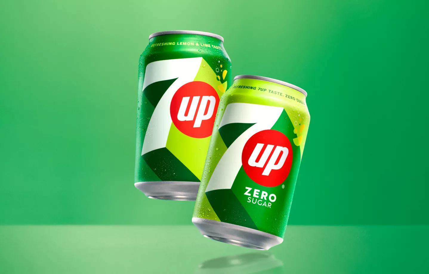
7UP's rebrand in 2024 is turning heads, and not just because of its vibrant new look. This is one of the most exciting refreshes the brand has seen in years. The classic lemon-lime soda has embraced a more modern aesthetic, aiming to capture the attention of a younger audience while still holding onto its nostalgic roots.
Design Elements:
- Color Palette: The new design features a brighter green, which adds an "uplifting" feel to the can and bottle designs. This change is meant to evoke a sense of freshness and vitality.
- Logo Design: The logo has been given a retro-style neon vibe, incorporating a cool 3D effect that highlights the number seven. This nod to the past is paired with modern elements, creating a balance between old and new.
- Packaging: The packaging now sports a sleek, minimalist design, making it stand out on shelves.
What It Means for 7UP
The rebrand is not just about looks; it's about rejuvenating the brand's identity in a crowded market. Research shows that visual refresh campaigns can increase brand recall by up to 80% when executed effectively. By focusing on a design that appeals to both long-time fans and new consumers, 7UP hopes to solidify its place in the beverage industry for years to come.
This rebrand is a reminder of how a fresh look can breathe new life into a product, much like how Liquid Remedy has enhanced its presence with a brand update in the U.S. market.
3. Jell-O: Classic with a Modern Twist
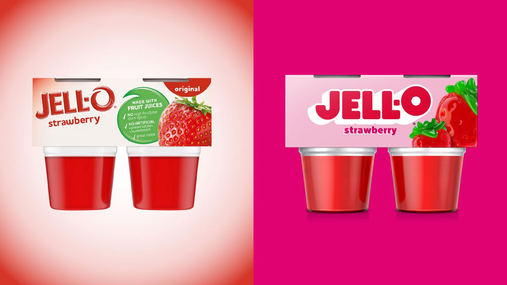
The iconic gelatin dessert brand, Jell-O, has undergone a significant transformation in 2024. This rebranding effort is all about blending the old with the new, creating a fresh look while keeping the nostalgic charm that has captivated consumers for generations.
Jell-O's new logo and packaging designs are all about simplicity and modernity. The brand opted for a cleaner, more streamlined design that still hints at its classic roots. The new look features a bold, sans-serif typeface that replaces the old script style, giving it a contemporary edge.
The packaging has been completely overhauled to match the new brand identity. Bright, vivid colors and playful graphics are now the stars of the show. This new design not only stands out on store shelves but also appeals to a younger audience, ensuring Jell-O remains a household favorite.
Embracing Playfulness
Jell-O's rebrand isn't just about looks; it's about attitude too. The new branding strategy emphasizes fun and playfulness, aligning with the brand's long-standing image as a joyful, family-friendly treat. Research shows that brands focusing on emotional connection see 2x higher customer lifetime value. This approach is designed to attract new generations while keeping long-time fans engaged.
Jell-O's rebranding is a perfect mix of nostalgia and modernity, making it more appealing than ever.
This rebrand marks a significant milestone for Jell-O, proving that even the most established brands can reinvent themselves successfully. With its updated logo and packaging, Jell-O is set to delight both new and old fans alike.
4. Eurostar: Unifying Travel Experience
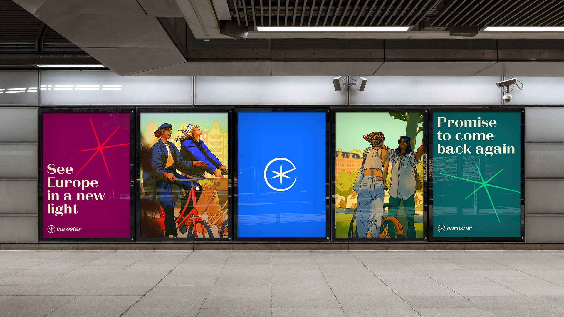
Eurostar, the train travel giant, has embarked on a transformative journey with its latest rebranding. This move comes after its merger with Thalys, another prominent train company, in 2022. The rebrand, unveiled in 2023, aims to unify the two brands under a single vision while enhancing the travel experience for millions.
Starting November 4, 2024, Eurostar will introduce revamped travel classes, replacing the Standard Premier with Plus. This change is part of a broader effort to modernize and simplify travel options for passengers.
The new Eurostar logo is a nod to its heritage, bringing back the "star" in its name. Designed by DesignStudio, the logo represents a fresh start and a commitment to double passenger numbers to 30 million annually by 2030.
Enhanced Passenger Experience
Eurostar's rebranding is not just about visual changes; it's about improving the overall passenger journey. The company is focusing on:
- Streamlined services to make booking and traveling more convenient
- Improved onboard amenities to enhance comfort
- Sustainable practices to reduce environmental impact
Eurostar's rebrand is more than a new look; it's a promise to deliver a superior travel experience, connecting people and places with ease and efficiency.
This rebrand positions Eurostar as a forward-thinking leader in train travel, ready to meet the demands of modern travelers.
5. Tupperware: Useful is Beautiful
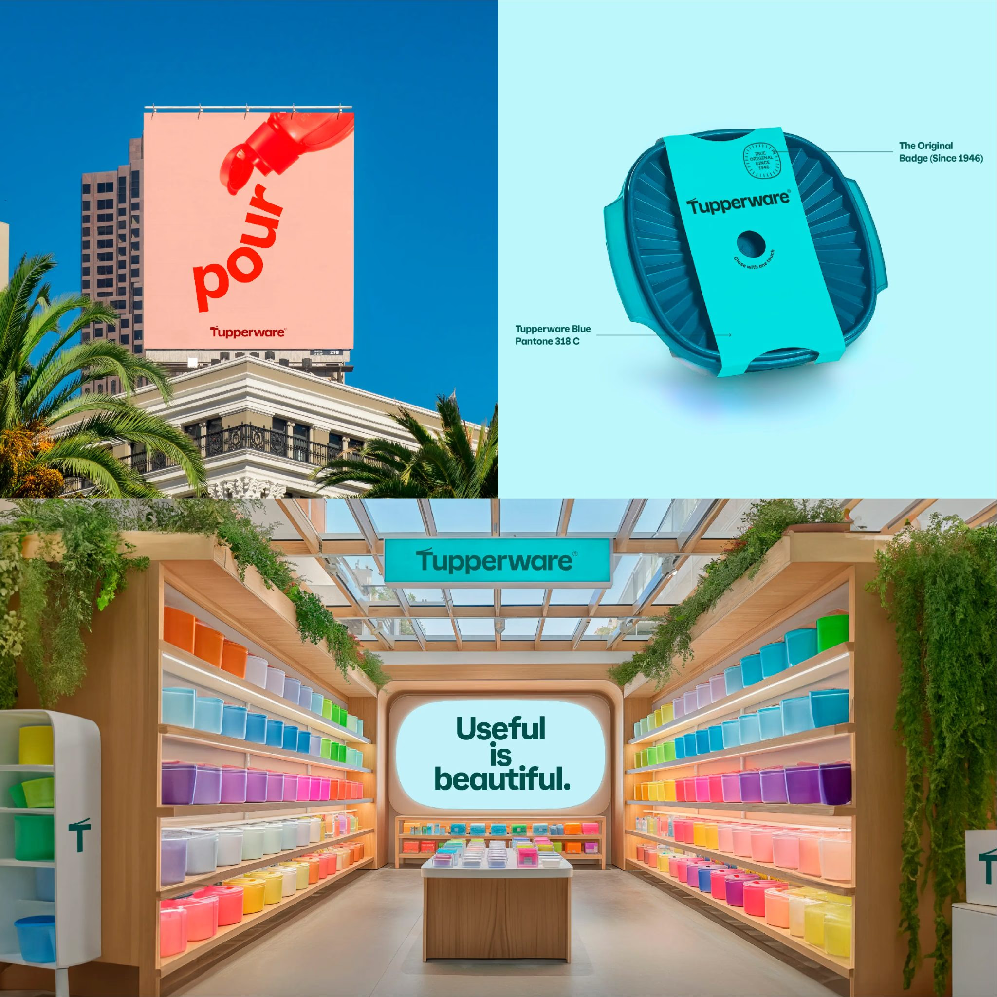
Tupperware has undergone a significant transformation in 2024, aiming to capture the hearts of a younger audience while staying true to its long-time supporters. The brand's new philosophy, 'Useful is Beautiful', perfectly encapsulates its commitment to blending innovative design with practical functionality. This approach not only highlights the durability of Tupperware products but also their focus on minimizing waste.
One of the standout features of Tupperware's rebrand is its dynamic logo, which cleverly mimics the iconic container's open-and-close motion. This visual nod to the product's functionality reinforces the brand's identity in a playful yet meaningful way.
The rebranding effort extends to a refreshed visual identity, where every element, from typography to graphic design, is inspired by the shapes and forms of Tupperware products. This design strategy showcases the tools in action, emphasizing their perfect functionality and seamless integration into everyday life.
Rebranding is a chance to connect with new audiences. As your customer base evolves, make sure your brand speaks their language and reflects their values.
In the context of a transaction set to close by the end of October 2024, Tupperware's rebrand underscores the importance of adapting to market changes and embracing new consumer trends. This strategic shift not only rejuvenates the brand but also positions it for future growth in a competitive market.
6. Goldfish: The "Chilean Sea Bass" Stunt
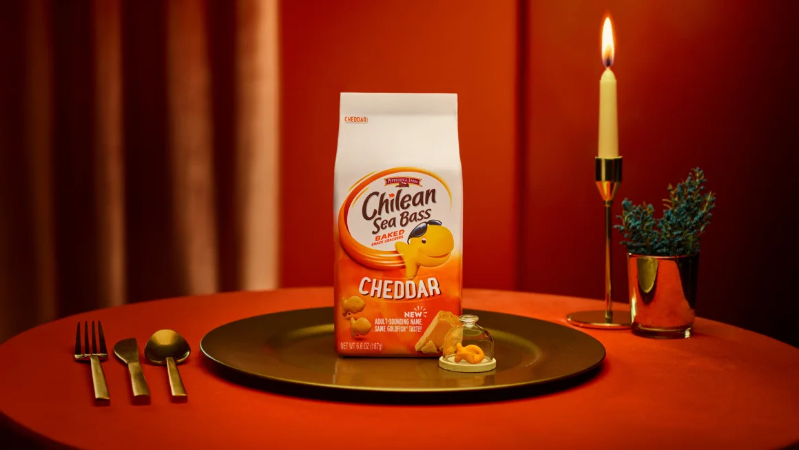
In 2024, Goldfish decided to shake things up with a bold marketing move. The iconic snack brand, known for its cheesy fish-shaped crackers, temporarily rebranded itself as "Chilean Sea Bass." This wasn't just a name change; it was a clever strategy to appeal to a more grown-up audience.
The rebranding was spearheaded by the creative agency Mischief @ No Fixed Address. Their idea was to show that Goldfish aren't just for kids anymore. With over 50% of the snack's consumers being adults, it made sense to target this demographic more directly.
The campaign was a hit, capturing the attention of many. It included a humorous video and a collaboration with the popular social media personality, Dude With Sign. The stunt generated over 3,000 media stories, with the vast majority featuring the "Goldfish" name prominently.
Research indicates that temporary rebranding campaigns can generate 10x more media coverage than traditional advertising when executed with humor and authenticity.
Campaign Highlights:
- Humor and Surprise: The playful nature of renaming a beloved snack to something as unexpected as "Chilean Sea Bass" was both amusing and intriguing
- Adult Appeal: By targeting adults, Goldfish tapped into a new market segment without alienating their existing fanbase
- Media Buzz: The campaign's quirky approach ensured widespread media coverage, making it a talking point across various platforms
Sometimes, all it takes is a little creativity and humor to breathe new life into a brand. Goldfish's temporary rebrand to "Chilean Sea Bass" proves that even a well-loved classic can surprise and delight.
This rebranding effort is a prime example of how a brand can maintain its core identity while also experimenting with new ideas to stay relevant. The Chilean Sea Bass campaign was a clever way to highlight the versatility and wide appeal of Goldfish snacks.
7. Kit Kat: Chunky and Modern
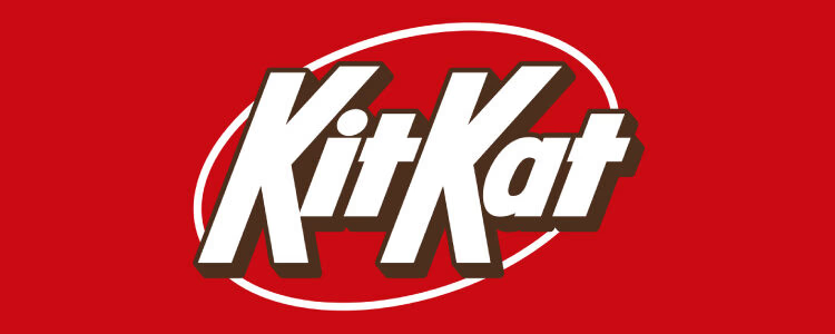
Kit Kat's rebranding in 2024 was a bold move that aligned its visual identity with the iconic chocolate bar's essence. The new KitKat logo features a straightforward and chunky design, moving away from the previous curved and shadowed letters. This change was spearheaded by Sterling Brands, aiming to reflect the crispy, creamy taste that Kit Kat is known for.
Key Changes in the Rebrand:
- Logo Design: The new logo adopts thick, straight lines, mirroring the bar's texture
- Visual Identity: A cleaner and more modern look that resonates with both long-time fans and new customers
- Market Focus: Targeted primarily at the U.S. market, where Hershey Co. manages the brand
- Brand Consistency: Maintains the core elements that fans love while introducing a fresh look
- Market Adaptation: Tailored to fit the U.S. market's preferences, ensuring relevance
- Consumer Engagement: Invokes the playful spirit of taking a break, a central theme of Kit Kat's marketing
Kit Kat's rebranding is a testament to how a classic brand can evolve without losing its identity. The new design not only aligns with the product's physical attributes but also enhances its market appeal, making it a standout in 2024's rebranding efforts.
8. Bose: Sound and Experience
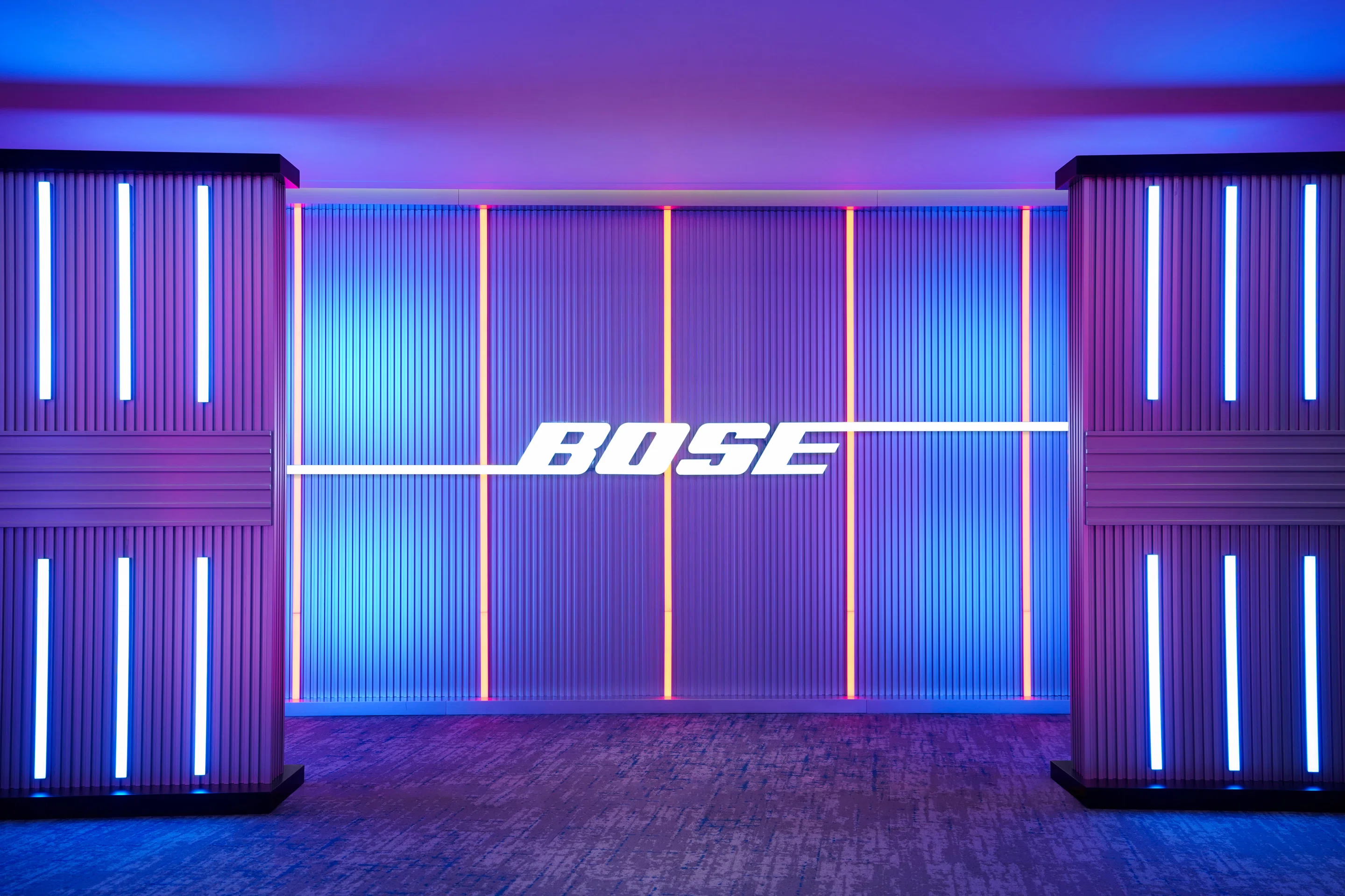
In 2024, Bose decided to shake things up with a bold new rebrand. This wasn't just a minor tweak here and there; it was a full-on transformation that aimed to push the brand into the future while respecting its past. The goal was simple: remind everyone that Bose is not just about sound, but about creating experiences that are unforgettable.
Bose's rebrand, crafted by the creative minds at Collins, introduced a fresh visual identity that feels both modern and timeless. They kept the iconic wordmark logo but gave it a subtle facelift, refining the design for a cleaner look. Alongside this, a custom typeface was developed, inspired by the fluidity of sound waves, adding a unique touch to the brand's communications.
The color palette got a vibrant update, bringing in lively accents that suggest energy and innovation. This was more than just a change of colors; it was about infusing the brand with a sense of vitality and excitement, making it stand out in the crowded audio market.
Partnerships and Collaborations
Bose didn't stop at visuals. They expanded their reach by teaming up with artists like Donald Glover and Ice Spice. These partnerships are more than just marketing moves; they reflect Bose's commitment to staying relevant and connected to different audiences.
As Bose approaches its 60th anniversary, this rebrand isn't just about looking back at what they've achieved. It's about setting the stage for the future, embracing new technologies, and continuing to deliver sound that moves people. Legacy brands must balance heritage with innovation to remain relevant. This evolution shows that even established brands can reinvent themselves and remain at the forefront of innovation.
9. Amazon Prime Video: Dynamic and Flexible
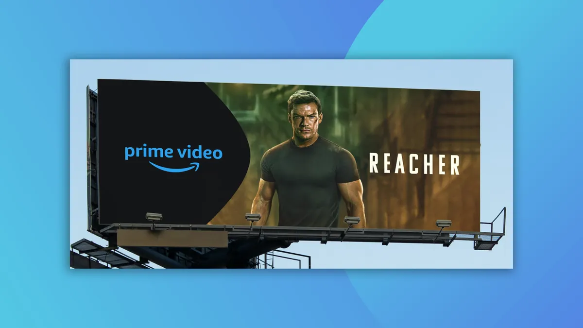
Amazon Prime Video's rebrand in 2024 was a game-changer, and not just because of aesthetics. It wasn't just about a new look; it was about creating a brand that feels alive and adaptable. The refresh was subtle but significant, focusing on making the brand more flexible to represent the diverse content it offers. The use of the "dimple" from the Amazon smile as a key design element added a unique touch.
Visual Identity:
- Dynamic Design: The rebrand introduced a more dynamic and modulated visual identity. This means the brand can easily adapt to different types of content, whether it's a blockbuster movie or a niche documentary.
- User Interface: The user interface saw improvements that made navigation smoother and more intuitive. This was crucial for enhancing user experience.
- Content Integration: With the integration of Freevee content into Prime Video, users now enjoy a more seamless viewing experience, accessing all their favorite shows and movies in one place.
Enhanced Viewing Experience:
- Streamlined Process: The changes have streamlined the viewing process, making it easier for users to find and enjoy content
- Broader Content Range: By integrating more content, Prime Video has expanded its library, offering something for everyone
- Improved Accessibility: The new design is more accessible, catering to a wider audience with varying needs and preferences
The 2024 rebrand of Prime Video wasn't just about looking good; it was about feeling good. It aimed to make the platform more engaging and user-friendly, ensuring everyone finds something they love with ease. The integration of Freevee content was a bold move, setting the stage for an even more comprehensive streaming service.
10. WhatsApp: Vibrant and Unified
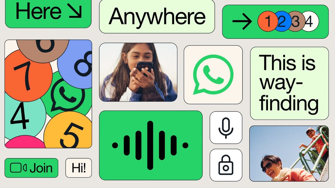
WhatsApp's rebrand in 2024 was a quiet but impactful move that refreshed its visual identity while keeping its core elements intact. The goal was to create a more flexible brand image that could seamlessly connect the app's user experience with its marketing strategies.
Design Updates:
- Color Palette: WhatsApp embraced a vibrant green accent, making it more prominent across its platforms
- Simplified Visuals: The design overhaul included cleaner, more straightforward visuals, enhancing the app's modern look
- Unified Identity: The rebrand aimed to unify the product experience with marketing, ensuring a consistent brand message
As we move into 2025, users with older Android devices should note that WhatsApp will discontinue support for several models starting January 1, 2025. This change is part of the brand's strategy to focus on newer technology and improve user experience.
Benefits:
- User Experience: The updated visuals make navigation smoother and more intuitive
- Brand Consistency: By aligning the app's look with its marketing, WhatsApp strengthens its brand presence
- Future-Proofing: The rebrand prepares WhatsApp for future technological advancements, keeping it relevant in a fast-paced digital world
This rebrand, while subtle, positions WhatsApp to continue as a leader in the messaging app space, adapting to both technological changes and user needs.
Conclusion
Wrapping up our look at the best rebrands of 2024, it's clear that this year has been all about bold moves and fresh starts. Companies are not just tweaking logos; they're rethinking their entire brand stories. From tech giants to classic food brands, everyone is jumping on the rebrand train, trying to stay relevant and connect with new audiences.
Industry research reveals that 73% of companies plan to rebrand or refresh their visual identity within the next two years, making 2024 just the beginning of a major branding evolution.
Some have nailed it, while others, well, not so much. But that's the risk you take when you shake things up. As we look forward to 2025, it'll be interesting to see who else decides to take the plunge and how they'll redefine themselves. One thing's for sure, the world of branding is never boring.